These 5 tips relate to something objective (display color accuracy) and something subjective (wallpaper preferences). They are my last tips specific to monitors. I plan to continue this series by writing about other elements of my office: keyboard, mouse, webcam, microphone, air purifier, ergonomics, and more.
1. When assessing a monitor in a store, be aware they are usually set to a “dynamic” picture mode to boost brightness, color, and contrast for a bright retail environment. So it doesn’t give you an accurate representation of what you’ll want to see in your home office. Double check measurements in store or online. Monitors these days deliver high visual quality at an affordable price. The top ones are still very expensive, but the average person has no need for a 6-8K monitor and there are diminishing returns at that resolution.
2. Eizo makes fancy self-calibrating LCD monitors, where a little sensor pops out of the top of the monitor (when you least expect it to) to calibrate your monitor and provide a spooky surprise. If you really care about consistent color accuracy, I’d recommend their monitors, having used them before. Otherwise you can purchase a third party calibration tool.
3. This Lagom tests page is a helpful resource if you wish to calibrate your monitor settings, but they haven’t been updated for high-resolution displays and most test patterns don’t work if your scaling isn’t set to 100%. Contrast, Black Level, White Saturation, and Gradient banding are the most useful tests. Eizo’s website also has good test patterns, but likewise avoid Sharpness and Gamma tests if your display scaling isn’t 100%.
4. Choose a desktop background that boosts your mood without overpowering whatever you’re doing. I prefer art that inspires me, landscapes with depth, or minimalist images with a subtle color palette and texture. This is what you see first and last during your workday, so ideally it is a source of calm and/or good vibes. Please note that a choosing a bright and saturated solid color can tire the photoreceptors in your eyes, and lead to imbalanced or inaccurate color perception.
5. For users of multiple monitors, there are some handy features you might appreciate in Display Fusion for Windows, or Rectangle app for Mac. I use the free version of Display fusion for my wallpaper, screensaver, monitor fading for focused work, and hotkeys I’ve set to move windows around.
Hope you enjoyed my 20 tips for monitors. How do you feel about the monitors and setups you’re using or have used in the past?

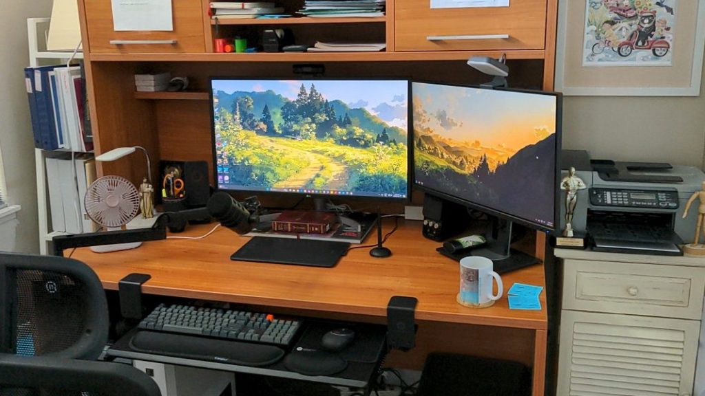
Photo Note: This is my home office in 2024 – Lots of re-organizing done and upgrades acquired to improve my work experience.